Process Mapping Software
By Dr. Ben S. Graham, Jr.President
The Ben Graham Corporation
Copyright 1996-2015, The Ben Graham Corporation. All rights reserved.
Links may be established to this paper.
The Basics of Process Flowcharting
Before we begin a process flowcharting effort it is important to determine the purpose of our process charts. If our objective is to plan without getting into detail we can use various methods of block diagramming. These techniques (referred to from time to time as diagramming, or charting, or mapping) use various shapes to record a general description of the logic that accompanies a work process.
Need for Detail, Rigorously Organized
However, when we want to turn our plans into action we need rigorously organized detail. It is one thing to dream about a new building. It is quite another to build it and before we order materials and pour concrete we help ourselves immensely by preparing engineering drawings. The same is true with manufacturing. For thousands of years manufacturing was accomplished by scraping, pounding and fitting but modern manufacturing gets enormous advantage by carefully drawing every part and every sub-assembly of the product first. Similarly, information processes are notorious for misunderstanding, counterproductive effort and muddling through. The time has arrived for rigorous detailed organization of business processes.
This is best done at the operating level by people who are knowledgeable about the details of the work. When managers attempt to redesign work processes they are limited to superficial information. If they seek help from outside consultants they simply move farther away from the detailed reality of the work. It is no wonder that they find themselves using flowcharting techniques that are built of generalities. This is what they have at their disposal. But, it is not sufficient for workflow improvement and it certainly does not deserve a title that includes the word engineering. (Much of what has masqueraded under the misnomer of reengineering in recent years is little more than reguessing being done by the same managers and consultants who have done it many times before.)
to the one in charge
or to the one who knows
what's going on?
This phrase speaks an eternal truth. In recent years increasing numbers of leaders have come to understand and accept this truth. And, they have found that when they seek to utilize the experience of their people (their most valuable resource) they find their people responding with ingenuity and integrity.
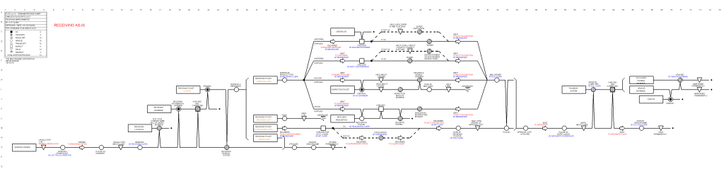
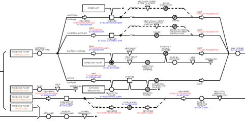
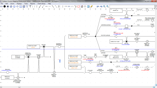
A Comparison of Charting Levels
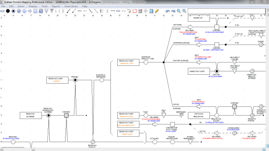
The following figures, (Figure 1 and Figure 2) compare a block diagram composed of boxes containing general descriptions connected by arrows with a detailed Graham Process Map (greatly reduced to fit on this page. To be readable it would have to be at least two or three times the size and to be used by a team it ought to be about five feet long.). Both charts display a receiving process. Obviously the Graham Process Map is much more detailed than the block diagram.
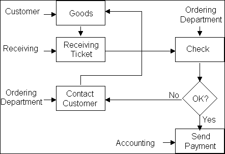
Graham Process Map
The simpler chart can appeal to people who do not want to take the time to get into the detail. But, the detail does not go away because we ignore it. If we intend to engineer our process we definitely need the detail. Here are some of the advantages that detailed process maps provide for us.
The Chart Items
With Graham Charts each item that plays a part in the process appears as a label followed by its own line along which appear the steps of its processing. This avoids a great deal of confusion and protects us against loose ends that have not been thought through. Block diagrams simply do not follow the flow of individual items. (Items include records, reports, data bases, products, materials, etc. Essentially they are the subject matter of a process.)
Left to Right, Straight Line, Horizontal
In the early years of preparing Graham-type charts, they were allowed to wander in any direction. A breakthrough that led to our current ability to chart large, complex processes was keeping the lines straight from left to right. Charts that wander make sequence hard to follow.
Also, the fact that they are kept horizontal makes them easy to display regardless of their size. It is much easier to read a chart that is three or four feet in length if it is horizontal than if it is vertical. If the chart gets larger yet, and many process charts run ten or twelve feet in length, it is still easy to put them at eye level if they are horizontal. If they are vertical, displaying them in one piece becomes useless. Cutting them and footnoting from one to the next destroys the picture.
Chart Shows Actual - Not Theoretical
What is recorded is what actually happens, not what theoretically should happen. The data is assembled empirically and the fact that each item has its own line assures that the process will be thought through. An open end of a line begs the question, what happens next.
Non-Value Added Work is Apparent
Unfortunately, when people think through a work process without dealing with individual items they tend to focus on what seem to be the major actions. These are invariably the value-added steps, the things that move the process along to completion. Meanwhile, real world processes usually have eight or ten non-value-added steps for every one that adds value. Block diagrams typically miss almost all of these.
People working with charts that only display value-added steps can get pretty self righteous about their value focus. However, we do a much better job of actually eliminating or improving the non-value-added steps when we address them. For example, an actual case involved a process that included ten minutes of value-added work that took nine days to process. After automating the ten minutes of work it still took nine days to process it. Later a proper process study of the same flow eliminated almost ninety percent of the processing time.
Consistent Knowledge of Location
The arrow symbol appears every time there is a change of location and with it are words that tell where the item has gone. Therefore, it is very simple for a person to determine location for every item throughout all of the steps of a workflow. All that is needed is to trace backwards from the step in question to the last arrow. Since that item hasn’t moved since then it is still where it landed at that time. These arrows also make obvious, opportunities for streamlining the process by reducing backtracking.
Redundancy is Obvious
Where you display the items, their redundancy becomes obvious. This leads to reduction of the number of records required to complete a transaction. Specific studies have reduced from as many as seventy-seven records to four, from forty-two to one and often in the range of from seven to one.
This keeps the focus on reducing work, not reducing staff. It is far healthier to reduce the work and keep the staff than vice versa. By keeping the staff the organization is able to grow, has capacity for further improvement and develops proud enthusiastic employees. How much better that is than drawing a simplistic chart, assuming that the work can be done with reduced staff and winding up with a process no better than, often worse than the one that was never really studied, with staff short-handed and alienated and the most experienced employees gone.
Process Quality
A great deal of quality stems from proper attention to detail. Not only is this detail shown on the Graham Process Maps, there is also a symbol, the square (Inspection), that calls attention to each time an item is checked to see if it is right. Careful study of process charts sometimes reveals places where inspections are not conducted that are costly omissions. Meanwhile, they also reveal, sometimes in the same chart, inspections that are completely redundant and unnecessary.
Records Storage and Disposal
Because each item in a process has its own line, the final disposition of each item becomes apparent. This is a major advantage when it comes to making decisions as to which records must be retained and which can be disposed of. Each item line that displays a record ends with symbols and verbiage that identify disposition.
Detailed Charts Provide a Vehicle for Harnessing Detailed Experience
When detailed charts are addressed by people who collectively possess many years of firsthand experience, they have no difficulty recognizing how their portions fit into the bigger picture. Since, collectively, these people have experience covering the entire chart, they have the appropriate knowledge to make informed decisions about it. This is worlds better than having people who never did the work imposing decisions based on superficial information.
Also, we find a by-product of improved cooperation from this effort. As the team of people from different areas work together, they gain improved understandings of each other’s work. This tends to overcome interdepartmental disagreements and establish a forum for creating organizational rather than departmental solutions.
People Whose Experience Equips them for Work Improvement
The people who are most ideally suited to improve work processes are the people who do the work. In addition there are people in various staff positions whose assignments put them “in the trenches” with the operating people and are therefore in a good position to support these efforts. Some of those staff people are:
- People in Forms Management - because they must work at the level of data entries, they have traditionally been more aware of the details of operations than most staff people. Today they are in a superb position to support electronic forms initiatives.
- People in Records Management - because the detailed work required to build and maintain effective classification systems for records requires that they become highly familiar with their organization’s information.
- Industrial Engineers - because their skills can supply the graphics and the cost and benefit measurements needed by the teams.
- Auditors and Inspectors - can be very knowledgeable about details of operations and can assist improvement activities effectively if they are able to maintain a focus of support rather than surveillance in their work.
How to Prepare Charts using Graham Process Mapping Software
Charts are drawn using a mouse to place symbols on a charting screen. The software draws horizontal lines between symbols automatically. Text is keyed in, attached to the labels and the symbols.
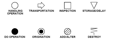
Symbols
The symbols have been proving themselves in world-wide use throughout most of the past century. They provide a powerful set of categories for gathering information on a process by assuring that the data is collected at an appropriate, elemental level. Then, after the documentation is completed, they provide powerful realism for the team as they analyze the process (See figure 3). For additional discussion of the symbols, see Flowchart Symbols for Business Process Mapping.
Conventions
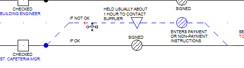
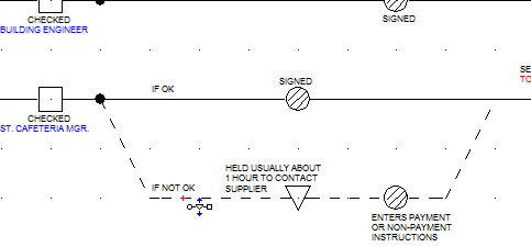
Since most processes involve the flow of more than one entity we use standard ways for displaying how the flows are interrelated. Figure 4 is a portion of a Graham Process chart that displays the conventional ways that we draw the lines to connect the symbols. Brackets show separation and assembly of items. Branching lines show different flows that follow decisions. Effects (Vees and inverted vees) show where information in one item is used to do something to another item.
Printing the Chart
Charts can be printed at an almost unlimited range of scales on all types of printers. Lasers and ink jets produce fine small charts while dot matrix printers and plotters do a fine job for larger charts intended for use by teams during improvement meetings.
How to Modify Your Chart
Once a chart is drawn, it can be revised by opening it up to include additional steps or by removing steps and then closing it up. Entire documents and groups of documents, regardless of how many steps they include, can be moved simultaneously. Portions of a chart can be deleted, copied or moved. During editing, text always remains adjacent to the symbols it describes, and connecting lines, both horizontal and vertical, simply elongate or contract as portions of the chart are moved.
Inserting Columns or Rows
Figures 5 and 6 show a chart being opened up by inserting columns. Note that the horizontal item line stretches and text remains positioned properly with the labels and symbols.
Inserting Columns, After
Figures 7 and 8 show a chart being opened up by inserting rows. It doesn’t matter how long a chart may be, the entire chart spreads vertically and all of the effects crossing the inserted rows simply stretch.
Inserting Rows, After
Deleting Columns or Rows
Deleting columns and rows works just the opposite of inserting, with the added feature that if removing either columns or rows will result in removing any significant element of the chart (symbols, labels, etc.) a warning will appear, giving the charter an option of going ahead with the deletion or canceling it. This is especially helpful on large charts where portions of the chart that are not currently on-screen would be affected.
Moving an Item
This feature is especially helpful when working with large charts. The charter selects an item line with the Move Item pointer, thus highlighting it. Then by clicking on a different row the item moves to that row while maintaining all connections with other rows. If moving the item to the new row would conflict with other parts of the chart the software will not accept the move. (See Figures 9 and 10.)
Moving a Correction Routine, After
Working with Blocks
Any portion of a chart can be selected as a block by dragging a box around it. The portion selected highlights in blue (Figure 11). Then the charter can modify the selection by selecting symbols or conventions that are outside of the currently selected block and by unselecting symbols and conventions that have been selected. Once the block has been selected it can be cut, pasted, or printed. When pasting, if the position chosen for pasting will conflict with parts of the existing chart, the block will not paste and the specific portion of the block that is in conflict highlights in red.
Revising Charts
These charting features make it possible to prepare charts easily and to modify them in much the way a word processor enables a person to modify a manuscript. You change only the portion of the chart that you want to change and the software automatically keeps the rest of the chart, retaining all connections. This ability makes maintaining libraries of process charts very doable.
Building and Maintaining a Chart Library
Each time a chart is prepared the organization gets one chart closer to having a full library of all of its processes in chart form. As the charts accumulate, it makes sense to organize them in folders consistent with the corporate organization and establish a repository to tend to their maintenance and distribution. The folder structure shown in Figure 11 shows a sample folder structure focused on Accounts Receivable.
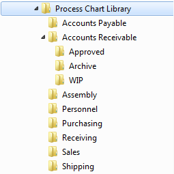
Folder Structure
There are three subfolders in the Accounts Receivable folder. Current/approved charts will be placed in the Approved folder. The “WIP” (Work in Progress) folder contains charts that are being worked on, and the Archive folder contains previously approved charts that have been superseded.
Starting an Improvement Project
When a project begins, a work simplification coordinator checks the library for a current/approved chart. If there is none, he builds one from scratch. However, if a current/approved chart exists, the work simplification coordinator copies it and rather than preparing a chart from scratch, takes the current chart through a walk-through and modifies it to reflect what is actually happening. This produces a new chart. The existing current/approved chart remains in the Approved folder while the new chart is worked through in the “WIP” folder.
Finishing an Improvement Project
Throughout the project all modifications to this chart accumulate in the “WIP” folder. When the team is ready to wrap up their project and present a proposal they use the current/approved chart as their “As-is” chart and the last version of their “WIP” chart as their “To-be” chart. The differences between these charts become their recommendations. After their proposal, the “To-be” chart is modified to match what has been approved and it becomes the new current/approved chart and the previous current/approved chart is moved to the Archive folder, where it is given an new extension (ie. 001, 002, 003).
Summary
Well-managed charting software enables an organization to build a library of processes in electronic form and maintain the library much the way industry has learned to document manufacturing with bills of materials and drawings. The items on a Graham Process Map are the equivalent of the bill of materials and the chart itself describes the process with detailed clarity akin to mechanical drawing.
This makes work processes clearer and there is less muddling through. Process libraries greatly improve the ability of an organization to manage complex processes, reducing misunderstandings and enabling operating people to be more effective masters of their work.