Detail Process Charts:
A Common Ground for Business and Development
By Ben B. GrahamPresident
The Ben Graham Corporation
Copyright 2008-2015, The Ben Graham Corporation. All rights reserved.
Links may be established to this paper.
When our processes are transparent...
the problems become apparent.
When the first flowcharts were applied to manufacturing processes, they followed the flow of a single part through its manufacture. They displayed, in sequence, the steps it took to make the part and they made sense. They were easy to visualize, easy to follow, easy to work with, and they resulted in millions of dollars worth of productivity gain.
This same concept was applied to information process charting in the 1940’s. However, rather than following a single flow, multi-flow process charts were used. They showed all of the records in a business process in order to make clear the exchange of information between records. Once again the effort generated millions of dollars worth of productivity gain.
Unfortunately, as our processes became more dependent on technology and organizations became increasingly enamored with that technology, we lost track of the fundamental characteristic of process mapping, which was the charting of real things. We backed off from the detail and tried to understand processes with charts that were high level arrangements of functions that did not enable us to see the delays, redundancies, complexity and confusion that our well-intended systems were creating in our processes.
Today there are many tools available for visualizing workflow. Few provide the detail necessary to understand a process and generate improvements. We have a choice between high-level process maps or detail process charts. If we want transparency, if we want to be able to make informed process decisions, if we want to build new systems that take advantage of all the knowledge that our employees have about the work we do, we need to work with the detail – using detail process charts.
The work simplification symbol set used in Graham Process Mapping was adopted as the ANSI and ASME standard for Process Charting over sixty years ago, a testimony to its fundamental simplicity. It has been used through a half century of new technologies and constantly changing processes with the grace of an alphabet…because it is fundamental. It is basic. It gets to the roots of our processes. It speaks the language of process. However, the fact that this symbol set is included (along with many others) in a number of diagramming packages with little instruction on how to apply them correctly is unfortunate. If the symbols are not accompanied by a methodology, then the charter has to invent one, which usually produces a flawed chart (missing items, confusion with who is doing the work, sources of information not available, awkward display of unusual situations, etc…) The work simplification detail process charting method uses a small but powerful symbol set and a method that provides an absolutely solid structure, which has easily and effectively charted all the situations that have occurred in thousands of work processes.
Four basic symbols represent doing work, moving work from one location to another, checking work, and nothing happening.

Four additional symbols represent variations of doing work: three variations of value-added work and a symbol representing destruction or termination. The value-added symbols are the Do symbol for manufacturing processes and the Originate and Add/Alter symbols for information processes. That’s it! Eight symbols.
The beauty of the charting method is its format. It breaks down the work to INDIVIDUAL items, with the processing of each item (document, form, letter, log, record, file, email…) represented as a horizontal line. Charts flow left to right. The name of the item is identified in a label at the beginning of the line and the activities (AND periods of non-activity) that occur are represented with symbols laid along the line in sequence.
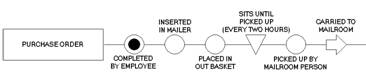
Most information processes include the processing of several items. The relationship between items is displayed with vee-shape lines that point from the item providing the information (the open end of the vee) into a symbol that represents the activity that happens to the other item.
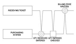
These relationships between items are what tie them together as a single process.
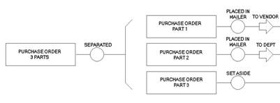
With a multi-flow chart, when the work divides or separates, the chart separates. What was a single flow line becomes multiple flow lines. This takes us back to our fundamental concept of breaking the work down into individual elements.
Even at a bird’s-eye view of a chart, (below) the number of items in the process stands out. Every horizontal line is a different item. Each is identified in the Label at the left end of the line. Can you count 15 of them?
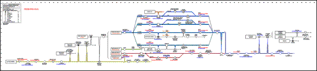
Note how simply parallel processing is displayed (Four Labels lined up vertically following independent paths.) The top path reaches a decision point where one of four alternative paths can be followed. Dotted alternative paths represent correction or rejection processing.
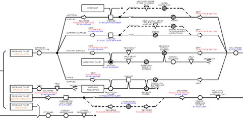
How many items are involved in this single-line, high-level flow below?
Benefits of Detail Process Charts
Simple, high-level charts can appeal to people who do not want to get into the detail. But, the detail does not go away because it is ignored. If we intend to engineer our processes we need the detail. Here are some of the advantages that detailed process charts provide.
The Chart Records
A detail process chart represents the flow of real things. Every record in the process is represented as a horizontal line beginning with a label. The processing steps occur in sequence along each line. The activities that are represented by the steps are happening TO the item named in the label. This helps avoid confusion and ensures that each item can be thought through. Single flow process maps necessarily group many items together in a single step (activity) and simply do not follow the flow of individual items.
Horizontal Flow - Left to Right
A breakthrough that led to our current ability to chart large, complex processes was keeping the lines horizontal, flowing from left to right. Charts that wander make sequence hard to follow. This is the typical nature of single flow process maps. Also, horizontal charts are easy to display, regardless of their size. It is easier to read a chart, whether it is three feet or twenty-three feet in length, if it is horizontal rather than vertical.
Charts Show Actual Work, Not Theory
What is recorded is what actually happens, not what theoretically could or should happen. The data is assembled empirically and the fact that each item has its own line assures that the process will be thought through. An open end of a line begs the question, what happens next.
Non-Value Added Work is Apparent
When people think through a work process without dealing with individual items they tend to focus on the major actions. These are invariably the value-added steps, the things that move the process along to completion. Meanwhile, real world processes usually have eight or ten non-value-added steps (that account for over 95% of the processing time) for every one that adds value. Most other charting methods miss this completely.
Consistent Knowledge of Location
The arrow symbol identifies every time the location changes. Therefore, it is simple for a person to determine location for every item throughout all of the steps of a workflow. All that is needed is to trace backwards from the step in question to the last arrow symbol. If you haven’t moved since then you must still be there. If you have moved there should be an arrow to show it.
Document Redundancy is Obvious
When you display each item, redundancy becomes obvious. When individual items are not displayed, redundancy is buried in the flow.
Controls Points are Identified making the charts most useful for audit
The inspection symbol identifies each time an item is checked to see if it is right. Careful study of process charts sometimes reveals places where inspections are not conducted that are costly omissions. They also reveal inspections that are completely redundant and unnecessary.
The Records Retention Situation Becomes Clear
Because each item in the process has its own line, the final disposition of each item is apparent. This is a major advantage when it comes to making decisions as to which records must be retained and which can be disposed of. Each item line that displays a record ends with symbols and verbiage that identify disposition.
Detailed charts Provide a Vehicle for Harnessing Detailed Experience
When experienced people read through a process chart that includes their work, they have no difficulty recognizing their portions and seeing how they fit into the bigger picture. When these people are assembled as a team, they have the appropriate collective knowledge to make informed decisions about the whole process. Also, we find a welcome consequence of this teamwork in improved cooperation. When teams of people from different areas work together on processes that they share, the team members develop improved understanding of each others work. This tends to clarify interdepartmental misunderstandings, establishes a forum for creating organizational rather than departmental solutions and offers developers and business folks an opportunity to communicate process in a common language.
SummaryGood people who understand parts of the process can get some value using high-level charts for improvement. Continued success in developing complicated, workable systems is a testimony to capable people who manage to be successful in spite of having inadequate or inferior tools. High-level charts provide enough structure to help an analysis team stay focused on a process, HOWEVER, the team has to dig into details to make good decisions.
Detail charts may be intimidating at first glance. However, the chart is a reflection of the process. If the chart is complicated, the process is complicated. If it is a challenge to understand complicated detail process charts, how else will we understand the more complicated processes they represent?
We need to instill into our organizations a discipline to master our processes and not be slaves to them. Learning the language of process – detail process charting –helps us get there.
Ben B Graham is President of The Ben Graham Corporation and author of the books 'The Process Improvement Project Guide' and ‘Detail Process Charting: Speaking the Language of Process’. His company pioneered the field of business process improvement, and has provided process improvement consulting, coaching and training services to organizations across North America since 1953. Ben has worked with many organizations to build libraries of business process maps and develop effective, process-focused, continuous improvement programs. His organization publishes Graham Process Mapping Software, which is designed specifically for preparing detail process maps. More information about the software is available at http://www.processchart.com